How our brand evolved

A target you want to reach!
A map to your destination!
A compass to guide you along the path that is right for you;
Avoiding pitfalls and gaps!
Identifying and Embracing opportunities along the way!
DESIGN CONCEPT
Understanding the Mission
We use our experience to guide our clients to reach their objectives.
Whilst maximising opportunities.
This resulted in selecting the components to incorporate to the logo.
The hues of Gold – symbolise the sun, the prize and enlightenment along the way.
With weathering for the experience we gain together.
Next came FIIGURE’s purpose, our tagline, to be:
“Your Guide to Your Dreams”
Shipping was the first means for international business – still used today!

This all combined to lead us to our brand colours.

Those that induce the feelings of:
Light, safety and arrival.
When we depict the sight of land and calmer waters as we approach, we visualise hues of green land, blue sky and the golden sun.
These were then incorporated with our logo on darker tones to accentuate our message.

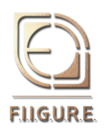
Adding Texture
To highlight the experience we have garnered – the texture was applied.
In imagery and in colour – applying texture.
Through these choices – We harness Simplicity – to tell our story!
Communication is Key in all we do.
In understanding through dialogue, the mission was embraced.
The message delivered!
Welcome to FIIGURE – We look forward to helping you reach your goals.
Contact us to help design or refresh your brand and story.